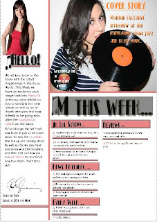
This is the first stage of the contents page, I first used the line making tool and the box making tool to select a basic layout for the page. I duplicated each box so as they were equal in size making so as it looked neater and more professional. The lines and boxes also help to organise the page as the lines break the page up making it look more tidy and neat.
Stage 2
I then added some of the pictures so as I could then start to layer over the top of them or work around them. For the main image on the right I chose to use a picture of my model, in the same outfit and the same prop as the front cover image so as the magazine has a flow to it. For the editors picture on the left I cut this picture out using the magnetic lasso tool and then used the rubber to rub around the edges to make it look more clean cut and neat.
Next, I added the basic text so as I could see how my layout was working and if I could change it in anyway. I used the same "Kismet" font as on the cover so as to continue with the retro old hollywood glamour image that is on the front cover. I also used the same music note shape that I used in M is for music on the front cover so as to create a brand for my magazine that the readers would recognize as a typical feature of my magazine if it was a real product.
 Stage 4
I then added the editors note, I used a different font as the Kismet font is effective for titles and larger fonts where as the smaller font of the editors note required a simple text so as it was easy to read. I also added highlights of pink to parts of the editors note that were important so as it stood out to the reader when reading it. As well as this I add a grey border behind the M this week so as to make it stand out more and a small pink line underneath Hello on the editors note so as the readers eye was drawn more to that half of the page as well.I added a signature that I found on google images as an extra touch so as to make it look more professional and fit the conventions of a music magazine. Finally I added a pug in the shape of an old vinyl record so as to continue with the theme of the old fashioned retro style of music my magazine is aimed at.
I then added the collums of writing that show the reader what is in the magazine, I again chose to do this in a different font to Kismet and so used the same one as in the editors note so as to make it easier and clearer to read. I chose to contrast the colour of font that says the page numbers and the colour of font that says the feature so as it didn't all look one colour which would make the page more appealing to look at.
I then added the secondary Images, I chose to use these secondary images as they fit the theme of my magazine and suit the page layout. The reason for using secondary images is so as to fit the conventions of magazines and also to make the page look more appealing to the reader as they get to see a sneak peak at what to expect in the rest of the magazine on the first page.
Stage 7
I then finally added the page numbers onto the pictures so as the reader could flick to that page straight away instead of looking through the whole magazine as well as adding the website for the magazine at the bottom of the page.


No comments:
Post a Comment