Friday, 30 April 2010

Double Page Spread Stages

Stage 1
Firstly I enlarged my picture landscape so as to create a background to the double page spread. I then added the secondary images on in roughly around the places where I wanted them to be so as I could see where I had space left for the text. I then finally added the page numbers in the corners.


Stage 2
Using the same Kismet font as on the cover and contents, which helps to connote the theme of Hollywood glamour I wrote the title "Mariah goes back to basics where is all began..." I chose to use the same music note symbol as I used in the other pages so as to create the brand image of the magazine. I also chose to highlight the word began and matched it with the colour of the music note so as it looks more appealing and not so dull so as to catch the readers attention. As well as using a simple B level and an outer glow on the text so as to make it stand out more.
Stage 3

I decided that the pictures didnt stand out enough so I used an image of a polaroid that I found on google images to put my pictures in. I think that this works well with the old fashioned vibe of the page that I am aiming to connote to the readers. To make the pictures stand out even more I added a drop shadow behind each polaroid.


Stage 4
I added the remaining text to the page, I chose to do this in collums so as to fit the conventions of a magazine. To make sure the collums were equal in size I used a text box to create a collum and then duplicated it and did this for as many collums as I needed. To make the writing stand out on the white background I added a beige box behind the text which I eyedropped from the beige rug the model is sitting on so as it matched the colour scheme of the page. I then added a pull quote from the text which encourages the reader to stop and read this page, I added a simple outer glow to the pull quote so as to make it stand out and jump out at the reader even more.


Content Page Stages


Stage 1
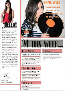
This is the first stage of the contents page, I first used the line making tool and the box making tool to select a basic layout for the page. I duplicated each box so as they were equal in size making so as it looked neater and more professional. The lines and boxes also help to organise the page as the lines break the page up making it look more tidy and neat.


Stage 2
I then added some of the pictures so as I could then start to layer over the top of them or work around them. For the main image on the right I chose to use a picture of my model, in the same outfit and the same prop as the front cover image so as the magazine has a flow to it. For the editors picture on the left I cut this picture out using the magnetic lasso tool and then used the rubber to rub around the edges to make it look more clean cut and neat.


Stage 3
Next, I added the basic text so as I could see how my layout was working and if I could change it in anyway. I used the same "Kismet" font as on the cover so as to continue with the retro old hollywood glamour image that is on the front cover. I also used the same music note shape that I used in M is for music on the front cover so as to create a brand for my magazine that the readers would recognize as a typical feature of my magazine if it was a real product.


Stage 4
I then added the editors note, I used a different font as the Kismet font is effective for titles and larger fonts where as the smaller font of the editors note required a simple text so as it was easy to read. I also added highlights of pink to parts of the editors note that were important so as it stood out to the reader when reading it. As well as this I add a grey border behind the M this week so as to make it stand out more and a small pink line underneath Hello on the editors note so as the readers eye was drawn more to that half of the page as well.I added a signature that I found on google images as an extra touch so as to make it look more professional and fit the conventions of a music magazine. Finally I added a pug in the shape of an old vinyl record so as to continue with the theme of the old fashioned retro style of music my magazine is aimed at.


Stage 5

I then added the collums of writing that show the reader what is in the magazine, I again chose to do this in a different font to Kismet and so used the same one as in the editors note so as to make it easier and clearer to read. I chose to contrast the colour of font that says the page numbers and the colour of font that says the feature so as it didn't all look one colour which would make the page more appealing to look at.


Stage 6

I then added the secondary Images, I chose to use these secondary images as they fit the theme of my magazine and suit the page layout. The reason for using secondary images is so as to fit the conventions of magazines and also to make the page look more appealing to the reader as they get to see a sneak peak at what to expect in the rest of the magazine on the first page.


Stage 7
I then finally added the page numbers onto the pictures so as the reader could flick to that page straight away instead of looking through the whole magazine as well as adding the website for the magazine at the bottom of the page.


Front Page Stages

Stage 1

This is the first stage of my Front cover, I firstly re sized the image to fit the A4 page layout, I encountered a few problems with the re sizing of images at first as the image looked to pixelated. I then added a red box (which I eyedropped the colour from the record player so as the colours matched) in the corner for the title of the magazine and a strapline bar at the bottom,so as to see where to lay things out on the page before adding the text. I then changed the opacity of the boxes so as they still stood out but the colour wasn't so harsh.


Stage 2

I then used the font "Kismet" to compose the title of the magazine, I used this font as I think that it suited my old hollywood glamour image that I am aiming to portray as the font is very 1920s so has a retro feel to it. After writing the title M is for music i then add a drop shadow and B level inner glow so as to make the white writing stand out more on the red background, I chose the colour white as it is clean and fresh and looks neat on the red background. I then added a musical note shape and moulded it in to M so as to create an image to the magazine that people would recognize. I then using the magnetic lasso tool cut around the head of my model on a seperate document and pasted it over the top of the original image, so it was overlapping part of the red box.


Stage 3


I then added the barcode and the date and issue number so as to fit the conventions of magazines, I added it at this stage so as I could see where I had space to put the other text on the front page.


Stage 4

I then added the strapline, in the same Kismet font so as to create an image for the magazine, I also done this by using the same musical note shape to seperate "Pixie Lott" and "Ellie Goulding" I think this suited my theme and also alows the readers to establish a common theme occuring throughout the magazine.


Stage 5
I then added the text, I chose to add the text onto the vinyl record and the record player. I did this as I think it looks unusual and unique to my magazine. For the text on the record player I followed the shape of the record player as much as I could, I done this by changing the direction of the text and using the diagonal tool, I chose white text on a black background as it stands out and also doesnt clash with the colour scheme of the magazine, I then used the red from the magazine title box to add "world exclusive" so it stands out and catches the readers attention. For the text on the record player I used black and orange boxes so as again to fit the colour scheme and to stand out on the red background, I changed the opacity to 82% so as the colour was still there but not so harsh. I then used the small arrow which appears and the corner to follow the diagonal shape of the record player on both the background and text.


Stage 6
Finally I added a pug in orange and blue, I eye dropped the orange from the inside of the vinyl and the blue from the models top. I also used the outer glow on the "25 Hot New Arists" so as to make it stand out against the orane background, I used these colours so as it fitted the colours on the image of the cover of the magazine.

Wednesday, 28 April 2010

Analysing Pictures For Double Page Spread


Double Page Spread Analysis

For my double page spread I captured the main picture landscape so as to fit the conventions of most magazines and have the pictures go across both pages. I also had to consider where to put the text so as it didn't go over the centre line making it unreadable.

Picture 1

This is an image I considered for my double page spread, I think that it is successful as it goes across the centre line of the page so meets the convention of magazine double page spread. Overall I dont think this image works well to be used as a final image as although I purposely put the records in as props I think it makes the image look busy and cluttered so wouldnt work well. I do however think that the image comes across as hollywood glamour and has a retro vintage feel to it with the models cheeky pouting pose and the use of the beige fur rug and the sequined outfit as it stands out on the beige and adds a glamourous feel to the image. Also another reason as to why the image wouldn't work well is due to bottom of the image the rug looks untidy,however if this was the only fault with the image then I could fix it by cropping it on photoshop.

Picture 2

This was another image I was considering for the double page spread, I think that this works well as once again the picture would cross over the centre line of the magazine, therefore sticking to the conventions of most double page spreads. Also the image is less cluttered than the other one but still has an element of music to it by the model holding the record which also relates to the old fashioned retro feel to the image as well as the artist "Johnny Cash" relating to the interview with the model. Also in this picture the space around the model is less cluttered so as it will look more professional when I add the layers in over the top. As welll as this the models pose is inviting as she is giving direct eye contact with the reader and has a warm inviting smile on her face which would encourage the reader to stop and read on. The type of shot is a full body shot which also works well as the readers get to see the whole outfit of the model and so could be seen as an aspirational figure which would also encourage them to stop on the double page spread.


Picture 3
This is another image that I took for the double page spread, overall the image doesn't work at all, the shot is taken too close so has cut part of the models head off, there is some of the background in the shot(wooden flooring) that is not supposed to be there. Also the models pose looks awkward and uncomfortable as there is no direct eye contact with the reader so would not stand out and catch their eye.


Friday, 23 April 2010

Analysing Pictures for Contents Page


Contents Page
The pictures I took for my contents page included some of the model on the front cover so as to have a flow to the magazine as well as some secondary images so as to give it a professional look as after looking at different exsisting contents pages it is clear that magazines use more than one image in the contents page.
Picture 1 (Of the Model)

Here is one of the images that I was considering to use on my contents page, I think that this image is quite sucessful as I like the effect of that you can see the face in the mirror as it looks unusual and stands out. I also considered it as an image for the contents page as it connotes the old hollywood style glamour which continues from the front cover, the glamourous style is created by the sexy red lips and the see through dress and the handheld mirror which adds the old hollywood style to the image. Also to keep it in theme with a music magazine the record player is in the background which was also used on the front cover to create continuity. The negatives to this photo are the wire that is coming from the record player and the image of the pug, however these faults could be edited out using photoshop.


Picture 2(Of the Model)


I also considered this image to be used in my contents page, overall I think the image is sucessful. The clean, fresh white background allows the model to stand out as well as the black record which I wanted to stand out so as to get my theme of old hollywood glamour and the old fashioned style of music comes across instantly to the reader at a quick glance. As well as this the pose of the model is sexy and seductive as she is biting the record and glaring at the camera so therefore would appeal to men and could also appeal to women as they aspire to be like the model. The lightting of this image is good as it is clear and clean to look at and everything that is in view is clear to see.

Picture 3 (Of the Model)
This was another image I considered to use on the contents page, I really like the over the shoulder shot effect and the use of the props such as the jewellery boxes and the lights on the mirror to give the impression to the reader that it is backstage a dressing room before perfoming on stage. The image connotes old hollywood glamour of being glamorous and has a vintage feel to the image so as to continue the theme throughout the front cover, double page spread and contents page. As it is an intresting image readers may see it in the contents page and it will draw them into reading the upcoming article, which is what I was aiming to do.


Secondary Images
These are the secondary images that I used in my contents page so as to relate to the conventions of other magazines as they usually have other pictures of people other than just the person on the front cover. These images also suit the overall image of the old hollywood glamour theme that I am aiming for throughout my pages as they have a vintage style to them and so therefore would suit the theme of my magazine.